Showing posts with label fashion. Show all posts

Sunday, 2 October 2011

Corinne Day : The Face


Last weekend I caught the Corinne Day exhibition at the Gimpel Fils Gallery for a friends birthday. Corrine Day, who died last year, is remembered for transforming fashion with her photographs of Kate Moss for the Face. I couldn't believe how young and fresh faced Kate looked in some of these photos from the start of her career in the 90's. I really love how Day's photos capture the hedonism of this era, celebrating the ordinary (Kate with no make up and lank hair) in contrast from the glossy aspiration of the 80's.

Saturday, 3 September 2011

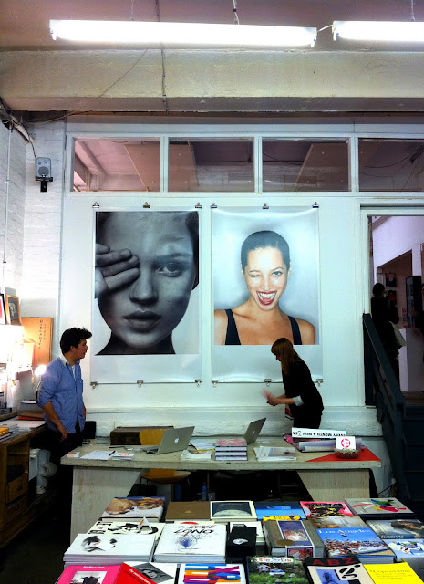
i-D NOW


"One eye open. One eye hidden. Wink! The blink of a shutter. The right eye is the right eye. Catch the moment in an instant. Knowledge transmitted by secret insiders. i-D is more than a magazine, and i-D covers have caught and continue to catch the moment when the imaginative power of a collection of people comes together. The best covers register and are recognised as a marker of the month, year and place. Hidden is the energy that has accumulated over 30 years, and there are now more than 350 covers - plus the ones that never got printed each with a personal story."

Terry Jones, i-D Founder and Editor in Chief


i-D NOW is a retrospective show celebrating 31 years of i-D magazine at the Red Gallery Shoreditch, until 18th September. It's fully worth the visit to see some amazing covers created by the world's top photographers, stylists and make-up artists. I have always loved the genius concept of the wink face and it was fantastic to see it through three decades featuring super icons of the times such as Kate Moss, Tom Ford and Sienna Miller.

Saturday, 14 May 2011

N E O N


This months Elle editorial has put me in a right summery mood! Model: Victoria's Secret Angel Erin Heatherto, captured by Mexican fashion photographer Enrique Badulescu.


(Elle UK June 2011)

Thursday, 31 March 2011

Monsoon Rebrand


As this week is my last of working PT at Monsoon Accessorize I felt it was quite apt to post about Monsoon's new rebrand. Founded in 1973 by Peter Simon, Monsoon began as a market stall on Portabello Road. With a focus of selling clothes from an ethnic origin made with unusual and colourful fabrics from far away places, Monsoon has always had a hippy vibe!

Now with this refreshed identity, the brand has finally been brought into the 21st Century. The old logo had felt dated for quite a while, this new logo works beautifully as it feels contemporary, feminine and still remains true to its roots with ornate curves to the M and N. The use of colour also feels much fresher and up to date with a peachy pink used with golds and creams - beautiful! The new Spring 2011 campaign, pictured above, stars Lily Donaldson and was photographed by Camilla Akran, resulting in some gorgeous imagery. You can pick up one of these lovely, large look books in store now.

Wednesday, 23 March 2011

Wish I was here...


Following the successful Be Stupid campaign, Diesel have taken it to the next level and created an entirely new stupid society, giving them a tropical island to inhabit! Like French Connection's recent campaign, Diesel has done a great job of bringing a tongue in cheek view to life. This campaign documents the first pioneers arriving on Diesel Island, solving the worlds oldest problems and having crazy parties to celebrate the birth of their nation. The whole concept behind Be Stupid and now Diesel Island is about having the guts to take risks, to take on the new and be inventive - something people all over the world can relate to and embrace.

On Diesel's website you can visit the island virtually and make up new laws (e.g. one of todays: 'pillow fighting is the national sport'), meet its citizens and buy island clothes through the interactive catalogue. You can also download a passport which gives you everything you need to know about the island, and there is even a Wikipedia page which is updated weekly as the society rules evolve. Diesel stores will serve as embassies, displaying the flag, maps and explanations of the philosophy behind the worlds youngest country.

The ideas behind Diesel Island are incredibly exciting with potential to roll out even further - particularly within digital media and inviting the audience to participate even more. I look forward to seeing how Diesel Island develops, maybe I can be teleported there one day?!

(source: Diesel)

Sunday, 20 February 2011

You are Man? You are Woman?


I have been meaning to blog my appreciation for French Connection's SS11 campaign for a little while, and walking past this billboard everyday this week prompted me to do so!

I think this is a really interesting concept, based on the masculine/feminine identity. A 'Man Camp' was set up on the island of Malta and 'Woman Camp' on the island of Gozo, created to discover the identity of men and women and men in the 21st century. They were ordered to do a series of 'manly' or 'womanly' tasks such as ride a horse into the sea and wrestle a biker. The result is a series of tongue in cheek, quirky and cool images. These are a few of my favourite, I think they are really fun, even if they don't make a lot of sense!

Drawing fashion


Last week I had the chance to see Drawing Fashion at the London's Design Museum, showcasing the most exceptional fashion illustration from the 20th and 21st century. The drawings reflect the spirit and style of the time, through Art Nouveau, Art Deco, Pop Art and beyond. Among my favourites were the works of Mats Gustafson, Antonio Lopez (top) and Francois Berthoud. Alongside the original illustrations were copies of the magazines in which they used like the early Lepape Vogue illustrations (I wanted to take them home with me!), film clips of the artists at work and projections of the couture clothes captured in the illustrations. This is the first time this collection has been displayed and is well worth the visit. The exhibition ends 6th March.

(top: Antonio, Lingerie 1966 bottom: Georges Lepape, cover design Feb 1922)

Monday, 7 February 2011

ELLE Collections SS11


I spent most of Saturday afternoon with the latest edition of the beautifully designed ELLE Collections. The magazines' bi-annual guide to the catwalk, has a more experimental approach to mainstream publishing, resulting in some really lovely spreads. Lots of cut out images, full bleed photographs and layering of type over image. Divided into 11 chapters, each is printed onto a different stock and has its own look and feel. These are just a few of my favourite spreads... (I'm also a fan of the Prada Banana!)


"ELLE Collections is unlike any other newsstand magazine in this country. As well as being a tool for the fashion industry due to the breadth of information from the runway shows and the exclusive access to designers it also has very high production values and an extraordinary approach to design and layout. I am extremely proud of it as ELLE Collections is produced by a small team alongside production of the main issue of ELLE. It is close to all our hearts. To evolve the magazine and celebrate its 10th issue we have also produced an iPad app ‘ELLE Collection - The Preview’, our first foray into the world of editorial apps." - Lorraine Candy, Editor-in-Chief


Monday, 24 January 2011

Harper's Bazaar


Harper's Bazaar is not my usual choice of glossy, but after a quick flick through I couldn't resist it's totally beautiful editorial spreads.

I really love the expressive use of typography throughout, particularly within the title pages of a number of the features, for example 'The Firth Factor' (which reminds me I MUST watch A Single Man). I think the experimental mixture of upper and lower case with italic and roman type is very interesting, it gives the pages a real style and edge whilst maintaining a sophisticated look.

I was also drawn to the S/S Collection pages which uses the most stunning location and vibrant colours, making me hungry for some sunshine! (photography by Norbert Schoerner)

In the bottom image I have picked out some pages which demonstrate the lovely use of a graphic device, which is like a signature to the magazine. Used for framing titles, bits of information or simply as a decorative interest. It is used both in full and in part, and in blocks of colour, or multiplied over an image. An unusual shape, and really lovely touch.

(Source: Harper's Bazzar Feb 2011)

Monday, 20 December 2010

Vogue on Vogue

I absolutely love these ghostly montages. Every 2010 cover for each Vogue edition, is layered into a single image, revealing something very interesting about formulas used, and highlighting those with a more experimental approach.

Every issue of every edition (minus text) reveals a common formula of a centred, dark haired, white skinned model.


12 UK covers brought together, the face is most predominant.


The 12 Paris covers, are at the opposite end of the scale to the UK covers creating something dark and all more interesting with varying type and image treatments. For everything else in between see Live Journal.


(Source: CR Blog, Livejournal)